In 2020, my resolution/quarantine hobby was learning how to draw and paint. The year before, I had to make a figure for a review paper, but I was paralyzed for weeks because I didn’t know what to make, and I thought I was bad at drawing. Determined not to let that happen again, I started figure drawing and soon delved into the intricacies of portraying plants and animals in watercolor. It reminded me of the botany class I took in college where every week we trekked through the Illinois forest and made anatomically accurate sketches of the plants we saw.
Art and science have always gone hand in hand. Leonardo da Vinci was skilled in dissection and was one of the first to create detailed drawings of the human heart and describe coronary artery disease. Current science and medical illustrators use a mix of photorealism, illustrative diagrams, and data visualizations as teaching tools. Other times, art is used to tell a story or promote the public interest, as Ashley Cecil did during her time as artist-in-residence at the Carnegie Museum of Natural History and the Richards-Zawacki lab at the University of Pittsburgh.
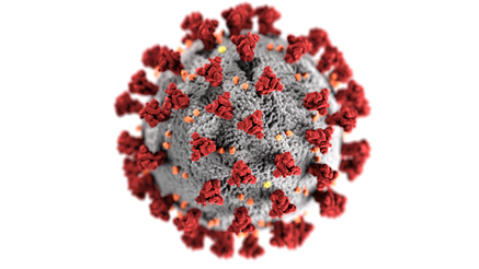
Illustrations have been essential during the COVID-19 pandemic, starting with the spiky blob that has been the face of the virus. Everywhere we go, there are images of proper mask-wearing, hand-washing, social distancing, COVID-19 symptoms to watch for, nasal swab testing procedures, and now, vaccination information. Data visualizations (less artsy) such as the Johns Hopkins COVID-19 dashboard have also helped us to keep track of infection trends.

Although text and graphs get the point across, there are many opportunities for scientists and physicians to incorporate illustrations:
- When you want to grab or keep people’s attention. Even simple graphics can add humor and visual interest.
- When talking to people outside of your field. People may not know the same jargon that you do, it can be easier to convey information with images.
- For complex ideas, pathways, and processes that are difficult to digest with long, dense paragraphs. Graphical abstracts are also becoming a more popular way to summarize papers.
- When photographs are too detailed or not possible to take. Anything from a simple sketch to a full color drawing can fill the void.
- For emphasis. Some points may need to be repeated in different formats.
For future papers and presentations, I’ll be less hesitant to incorporate illustrations of my own. Even if you don’t consider yourself an artist, images and illustrations are freely available from sites such as Smart Servier Medical Art or the CDC’s Public Health Image Library. Or make drawing your newest hobby, too, to gain a greater understanding of your work and the world around you.
“The views, opinions and positions expressed within this blog are those of the author(s) alone and do not represent those of the American Heart Association. The accuracy, completeness and validity of any statements made within this article are not guaranteed. We accept no liability for any errors, omissions or representations. The copyright of this content belongs to the author and any liability with regards to infringement of intellectual property rights remains with them. The Early Career Voice blog is not intended to provide medical advice or treatment. Only your healthcare provider can provide that. The American Heart Association recommends that you consult your healthcare provider regarding your personal health matters. If you think you are having a heart attack, stroke or another emergency, please call 911 immediately.”