Welcome to part 2 of the collaborative studies series. In my last post, titled “Collaborative Studies: Are They Worth It?” I discussed what collaborative studies are, how they come about, and the pros and cons of conducting them. In this post, I’ll dive deeper into analytical strategies for harmonizing data in collaborative studies and in the next post, I’ll recap some advice on how to conduct a successful collaborative study.
Note: This series is based on a pre-conference workshop session at the 51st annual Society for Epidemiologic Research meeting in Baltimore, MD in June 2018. Dr. Bryan Lau, Dr. Keri Althoff, Dr. Josef Coresh, Dr. Jessie Buckley, and Dr. Lisa Jacobson of Johns Hopkins Bloomberg School of Public Health, shared their knowledge, advice, and experience on working with collaborative studies.
Recap: What are Collaborative Studies?
Collaborative studies are a collection of multiple independent studies collaborating together for a scientific goal. This broad definition groups together many different types of collaborative studies, from multi-site randomized trials with standardized protocols to pooled data from several different cohort studies. What these different examples have in common, however, is at least some overlapping data elements and buy-in from leaders of each participating study. (Learn more in Part I of the series)
Harmonizing Data from Heterogenous Studies
In Part I, I alluded to analysis methods for harmonizing data, and brought up important considerations such as unbalanced confounders and non-overlapping data elements. Like with any research project, one of the first steps is to get to know your data – look at missing data, check derived variables, etc. The importance of this step when working with collaborative studies is magnified – are some of your data elements missing from certain studies? Were similar variables derived differently?
To combine datasets, you need individual level data to harmonize, generate estimates at the cohort and meta analysis estimates, and evaluate your inclusion and exclusion criteria
To combine datasets, you need individual level data to harmonize. In getting to know your data, you’ll generate estimates at the contributing study level, and at the meta-analysis level, with all studies contributing. You also need to develop inclusion and exclusion criteria at the study level and do basic validity checks, like checking for strange values and looking at trends by year.
Meta-Data Visualization
Looking at each contributing study alone, at the cohort-level, is called meta-data visualization. The idea is to examine core data elements in each cohort – when did the study start collecting it? How did they measure it? – and check ascertainment assumptions to construct observation windows. Observation windows are constructed from calendar time points ine ach cohort where there is nearly complete ascertainment of a data element. You’ll compare these observation windows for all contributing studies later to look for overlap.
Why are observation windows important? To avoid immortal person time bias, just like at the individual level in a study. If Study A didn’t start collecting fasting blood glucose until 2002, none of study A participants can contribute that data element to the meta-analysis. you would not to include any contributing time prior to that. Since there is usually a 6-12 month delay in receiving data, you’ll also need to trim observation windows at the proximal end.
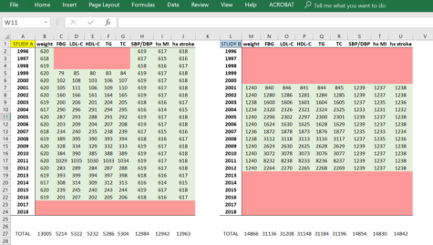
Dr. Keri Althoff presented a handy “spreadsheet histogram” having data elements across the top row, calendar year down the first column, and the number of observations for each year for the corresponding data element (example below). Shading values green for good ascertainment allows you to visualize observation windows and examine overlap of related values, like blood pressure, comorbidities, and lab values. Each contributing cohort would have their own spreadsheet.
To apply these observation windows, each participant’s time at risk becomes a complex algorithm incorporating their respective study’s start and end dates, a data element’s observation window, or other interested window, and other factors you may want to include. But a complex algorithm is just that – an algorithm! Understanding your data and methodologically setting up this system to minimize bias in your data is well worth the time.

Caption: Example “spreadsheet histogram” showing observation windows for various data elements in hypothetical Study A and Study B. You can see that they have different study start and end times, and Study B has a larger proportion of the study with lab values.
Lumping and Splitting
Once you have your dataset, you’ll want to lump and split. What’s that, you say? Lumping is when you combine all contributing studies, run your analyses, and examine the findings. You should think about – what does this new study population represent? Is it an interesting population? Who do they generalize to? Does it generalize to your target population, or perhaps is it your target population?
Then split off one, or two, or more contributing studies and compare the findings. Splitting is a key step to make sure one study isn’t dominating the analyses. You’ll know from your spreadsheet histogram if only one study is contributing a data element, and hopefully you carefully check that assumption and consider the implications of allowing that one study to stand in for all others in that variable.
Hope you enjoyed part 2 of this collaborative studies blog series. In the next post, we’ll talk about some practical tips for conducting a successful collaborative study, like getting buy-in from investigators, keeping everyone invested, and smoothing the way for everyone to get along.
Upcoming Posts:
- How to conduct a successful collaborative study: the nitty gritty
- Interested in something else specific? Leave a comment or tweet us @BaileyDeBarmore and @AHAMeetings to let us know!
Follow Drs. Althoff and Lau on Twitter for great EPI methods tweets
- Keri Althoff – @KeriNAlthoff
- Bryan Lau – @BL4PublicHealth

Bailey DeBarmore is a cardiovascular epidemiology PhD student at the University of North Carolina at Chapel Hill. Her research focuses on diabetes, stroke, and heart failure. She tweets @BaileyDeBarmore and blogs at baileydebarmore.com. Find her on LinkedIn and Facebook.